Directional Signs & Their Optimal Design
Road signage is different from your typical business card. When handing a potential customer a business card the audience is captured,the customer can look at the card at any time. Weekend directional signs are a much different type of advertising. Directional signage needs to capture an audience while they are moving, and they need to process the information on the spot. The sign needs to be simple enough for your potential customer to receive your message and call to action in just a few seconds. Drivers are typically moving on a highway about 45 miles per hour. That means they are moving at 66 feet per second. The unique hurtles with roadside directional signage changes how to create an effective sign.
Drivers are typically moving on a highway about 45 miles per hour. That means they are moving at 66 feet per second.
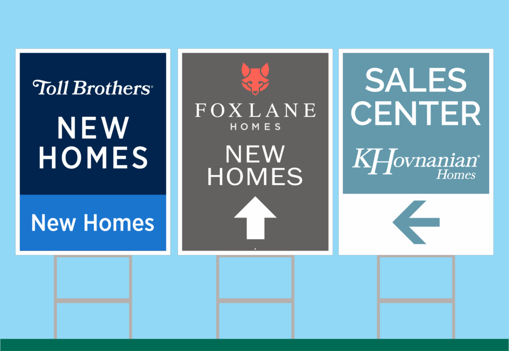
Design is the largest component for an effective sign. That being said, design principles are important for print designs when designing a brochure or a magazine, but the most effective roadside signage use the design principles a bit differently. An example of a design element that is changed a bit for roadside signage is the design principle of contrast. Contrast is still important; the details of proper contrast are a bit different. It is strongly recommended in print design to keep a nice light background with dark bold text to be easy on the eye. Typical brochures have white backgrounds and are easy on the eyes to keep the customer captured and interested. For roadside signage a dark background with big light bold text is always best. Great examples of this are street and highway signs. Highway signs are dark green with white bold text. Directional signs would stretch this a bit further to grab attention. Using bright neon colors is very common; this would never be seen on a speed limit sign. For directional signs the most effective signs are not easy on the eyes. The most common color that is seen is a blue and white sign. Since standing out is the main goal colors such as red, orange, yellow, purple, black and even pink are great alternatives. Combining these colors with the darker color as the background and the lightest for text is best. The sign will read well from the road, and be seen well against other signs.
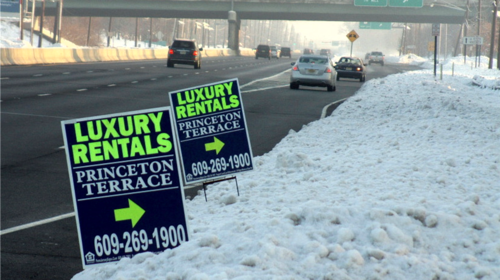
Arrows are where a great sign can go bad. The whole purpose of directional signs is to direct your buyer. If a customer cannot see a clear, defined arrow there is no point of the directional sign if it cannot direct anyone. The most common mistake seen is a very long arrow tail that will stretch across the entire sign. While it can be a great design element, it makes the arrow less defined from a distance. The head and pointed part of the arrow should be much wider than the tail. It makes the point contrast well and reads much better from a distance. The actual size of the arrow matters as well. While a large arrow that takes up most of the sign is great, it is simply not necessary. A simple 6” arrow on an 18”x24” is more than sufficient. Continuing with the theme of contrast, the arrow is no exception. An arrow should be a bold contrasting color that sticks out from the rest of the colors on the sign. Many people like the arrow to match and blend well into the color pallet of the sign. While this looks nice and is easy on the eye that is not the goal of a directional sign. The arrow is the most important part of the sign, make sure it sticks out and grabs attention.
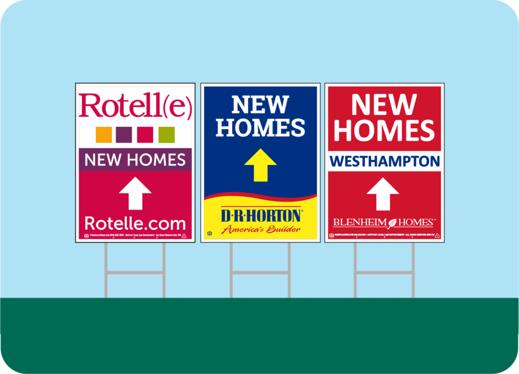
Keeping a design simple is the key to a successful sign. The most important text for a potential customer to contact a sales agent would be all the text recommended for a sign. This is typically under 6 words. A short message, such as “New Homes!” a logo and a phone number is all the information a person can read in just a few seconds while driving past a sign. A customer should never miss a turn because they were reading too many details about sales incentives on a sign. Always keep the goal of having potential customers reach your sales center in mind.
An effective directional sign is all about simplicity and grabbing attention. Keep in mind the main goal of having customers arrive at a sales center. A directional sign campaign does not need a large budget and bells and whistles to be successful.
Give our team at Penn Jersey Signs a call to help with your signs! 610-808-6330